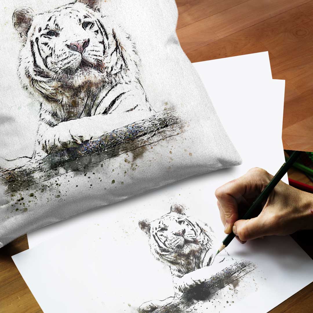
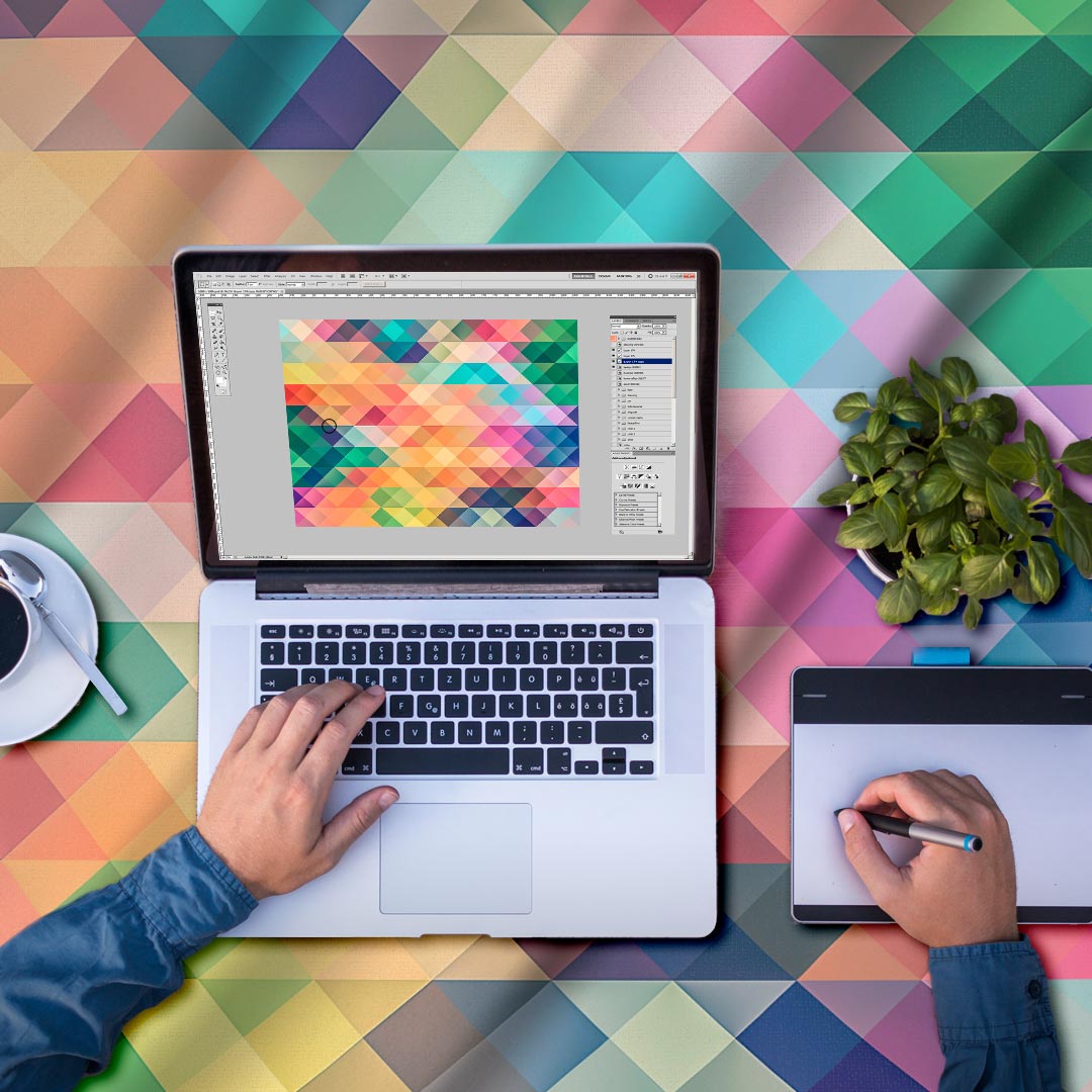
With digital printing, you can utilise any number of colours in your design and create millions of unique colours.
However, since each computer screen is different, the printed fabric will not look exactly the same as what you see on your screen. If you print your design using your home printer, it will also appear differently due to differences in ink, material and technology used in digital textile printing. Proper lighting is also crucial in accurately reproducing colors.
We have compiled some information on colors and provided tips on achieving the most accurate color representation possible. It’s important to note that different printing methods will produce varying results in color. When considering the entire color spectrum with all the colors in the world, pigments and dispersion can reproduce almost all colors, whereas the reactive printing method has a more limited color range. As a result, reactive colors may appear slightly muted compared to those produced using pigments or dispersions. However, both reactive and dispersion printing methods excel in reproducing extreme colors such as pure black and vivid red.
Pigment
Print on the left image on the right

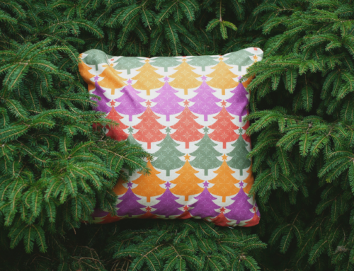
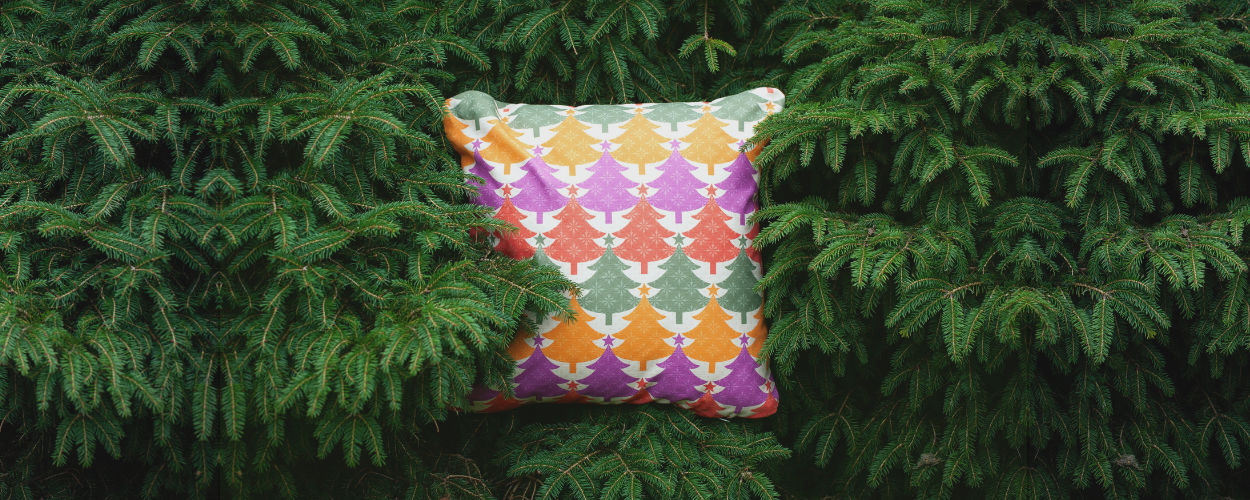
The Mom pattern is produced using the pigment method on organic poplin.
Dispersion
Print on the left image on the right

Reactive
Print on the left image on the right

The blue and white pattern is printed by the reactive method on the cotton side.
Colours and light
The basis for experiencing all colours lies in white light, which contains a spectrum of all visible colours. We can see these colours in the rainbow or when light is refracted in a piece of glass. “In the dark, all cats are grey” says an old proverb, but if we turn on the light we can see the real colours of the cats provided it is white light. If we light a red candle instead, all cats turn red.

Colours in different lighting. Wikipedia.
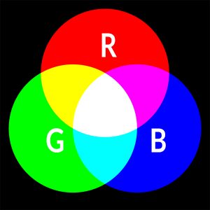
RGB
To recreate these colours, we require a colour box containing all the colours of the spectrum. This can be achieved by using three colours – red, green and blue – in the appropriate mixtures. If you observe your computer screen or TV with a magnifying glass, which operates similarly, you will notice small glowing dots of varying intensities based on the shade of the colours displayed.
In our production at elobina, we use RGB colors.
Digital photographs are automatically in RGB format. However, if you are working in software such as Photoshop, it is advisable to switch to the Adobe RGB colour profile from the outset. You can do this by going to Edit and then selecting Color Profile. For optimal results, we suggest using a dpi of 200.
It is worth noting that many home printers use CMYK colours. This means that when you print an RGB image, the printer will automatically convert the colours to CMYK (which consists of cyan, magenta, yellow and black).
Test yourself
If you wish to ensure that your colours are absolutely accurate, it is recommended that you create a test print using various colour variations. You are welcome to experiment with different levels of colour saturation and brightness. This is particularly important if you have previously used a different printing company, as it is essential to achieve the best possible results. We can also adjust the colour saturation and brightness after printing if necessary.
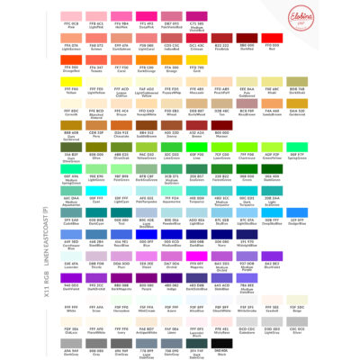
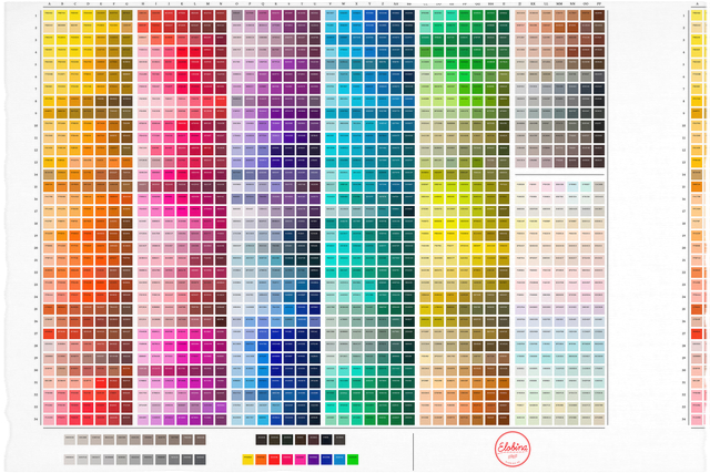
We have produced colour charts to provide an idea of how the colours will appear. However, it is always advisable to print your own designs onto one metre of fabric to determine precisely how they will look. Our design studio can assist with colour matching if required. You may then submit a physical copy of the desired colour.

Tips and tricks
- In digital printing, the colour white does not exist but is determined by the fabric chosen. Additionally, metallic colours are not available, but by mixing colours correctly, a metallic surface effect can be achieved, especially on shiny fabrics such as silk and satin.
- The appearance of colours varies depending on the material used. The brightest colours are achieved on synthetic fibres, and the weight of the fabric affects the colours as well.
- The colour of the fabric also plays a role. If the fabric is natural white, the colours will appear slightly more muted than on an optical white fabric.
- If similar dark colours are used, they can blend into one another, especially in reactive printing, if there is not enough contrast.
- Large areas of dark, saturated colours usually do not have the same visual impact as on a screen, especially on natural fibres. The colour may appear slightly uneven. It is generally better to use artificial fibres for large areas of dark colours.
- In pigment printing, it is challenging to achieve the deepest black or the brightest red. For these extremes, it is advisable to use the dispersion or reactive method (the colour code R0B0G0 applies to both methods). The blackest pigment colour is achieved with R2G2B6.
- Highly saturated dark colours, printed in large solid areas, do not have the same visual impact as on a monitor. Inks tend to make saturated colours look a little different from what you might expect.
- If your design includes delicate details, it is best to use contrasting colours.

Leave A Comment